 Promotional Products



Introduction
If your lanyard looks crowded, cheap, or hard to read from three feet away, the problem usually is not the printer. It is the design plan. Strong custom lanyard design balances brand visibility, wearability, color contrast, and production limitations long before the first proof is approved.
That is where experienced suppliers matter. Best Patches has worked with brands, schools, event teams, and organizations that need lanyards to do more than hold a badge. They need to reinforce identity, support security, and still look clean after repeated daily use.
Custom lanyard design is the process of choosing the right layout, materials, colors, logo placement, and artwork specifications for a printed or woven lanyard. A good design makes branding visible at a glance while staying legible, durable, and comfortable to wear.
When done well, a custom lanyard becomes a practical branding tool. When done poorly, it turns into a narrow strip of clutter that weakens your logo instead of promoting it.
Table of Contents
- What Makes a Lanyard Design Work
- Choosing the Right Lanyard Type
- Logo Placement Rules That Improve Visibility
- How to Pick Colors That Print Cleanly
- Artwork Specs That Prevent Production Errors
- Design Workflows for Different Business Goals
- Common Mistakes, Risks, and Limitations
- Case Study From Best Patches
- How to Approve a Proof With Confidence
What Makes a Lanyard Design Work
A lanyard has a tiny canvas and a moving surface. That changes everything. Unlike a flyer or a webpage, your design is viewed while wrapped around a neck, partially twisted, and often seen at angles. That means clarity beats complexity almost every time.
The best-performing lanyards usually share a few traits:
- One primary message, usually a logo or brand name
- High contrast between background and artwork
- Repeat spacing that keeps the logo visible even when the strap twists
- Artwork simplified for narrow-width printing
- Hardware and attachment choices that support the use case
According to a 2024 report by the Promotional Products Association International, useful branded products tend to retain stronger long-term visibility than disposable print pieces because people keep and use them repeatedly. Lanyards fit that category well, but only if the design supports daily use rather than treating the strap like a miniature billboard.
“The strongest lanyard designs are usually the simplest ones. If a logo cannot be recognized instantly on a moving strap, it needs editing, not decoration.”
Choosing the Right Lanyard Type
Before you choose logo size or background color, choose the construction method. Material and print style directly affect what artwork is possible.
Printed polyester lanyards
These are versatile, cost-effective, and great for bold logos, gradients, and full-color branding. They are often the easiest option for event badges, schools, and office ID programs.
Tube lanyards
Tube styles are softer and budget friendly, but the print area and finish can feel more casual. They work for giveaways and short-term events but may not deliver a premium brand impression.
Woven lanyards
Woven designs are durable and crisp for simple logos and text. Fine detail is limited, so they are better for clean marks rather than intricate illustrations.
Dye-sublimated lanyards
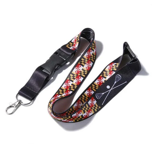
For complex artwork, gradients, and vibrant color fidelity, dye sublimation is often the best route. If your brand relies on specific tones or pattern-heavy visuals, this method usually performs better than basic screen printing.
Logo Placement Rules That Improve Visibility
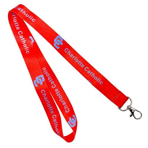
Logo placement is where many designs fail. Teams often center a large logo once and assume it will read well. But lanyards are seen in fragments. A repeated logo pattern usually works better than one oversized mark.
Use repeat intervals strategically
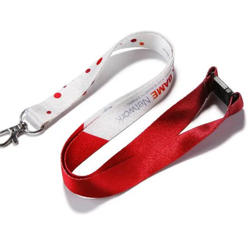
Place the logo at regular intervals so at least one full mark remains visible from the front while the lanyard is worn. In most standard layouts, repeating every 8 to 12 inches creates better visibility than a sparse design.
Respect the safe zone
Keep logos and text away from edges, clips, buckles, and attachment folds. A narrow margin prevents cutoffs and keeps the design from looking cramped.
Match orientation to wear position
Text should read properly when the lanyard hangs down. Some brands prefer a mirrored repeat from each end toward the center so the design remains readable on both sides of the neck loop.
Keep small details out of the battle zone
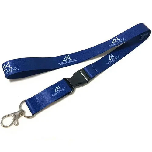
The area near the swivel hook, safety release, or buckle gets the most visual interruption. Reserve that space for background color or simple repeating patterns, not crucial brand elements.
When we review client proofs at Best Patches, we often reduce the logo before enlarging it. That sounds backward, but on a narrow strap, oversized logos get cropped, while slightly smaller repeated marks stay readable in real use.
How to Pick Colors That Print Cleanly
Color is not just about brand guidelines. It is about visibility, contrast, stain resistance, and print behavior on fabric.
Prioritize contrast first
A navy logo on black webbing may look sleek in a brand deck, but it disappears in motion. For practical results, pair dark logos with light grounds or light logos with dark grounds. Mid-tone on mid-tone combinations are the most common visibility mistake.
Use Pantone references when possible
If brand consistency matters, provide Pantone values instead of only RGB or hex codes. Fabric and ink absorb light differently than screens do, so digital approximations can be misleading.
Think about dirt and wear
White and pale pastel lanyards look clean at first but show grime quickly in schools, hospitals, warehouses, and outdoor events. If the lanyard will be worn every day, darker base colors usually age better.
Limit accent colors on narrow layouts
Too many colors make a thin design look noisy. In many cases, one base color plus one artwork color is enough. Two artwork colors can work well if the logo is simple and spacing is generous.
According to Adobe’s 2024 creative trends reporting, brands continue to favor high-contrast, instantly legible visual systems across physical and digital touchpoints. That trend matters for lanyards because split-second recognition is the whole game.
“Brand color accuracy matters, but readability matters more. If your exact shade lowers contrast, adjust the application rather than forcing a weak combination.”
Artwork Specs That Prevent Production Errors
Good artwork setup prevents expensive revisions. A clean file also speeds proofing and reduces misunderstandings with production teams.
Preferred file types
Vector files such as AI, EPS, or SVG are best for logos and text. They scale without quality loss and allow cleaner separation for print methods. High-resolution PNG files can work for certain sublimated designs, but they are not ideal for every process.
Outline your fonts
If text is included, convert fonts to outlines before submission. That eliminates missing-font issues and ensures your wordmark stays intact.
Remove tiny details
Hairline strokes, miniature taglines, and subtle gradients often fail on fabric. If a detail cannot be seen clearly at lanyard width on a phone screen, it probably will not print well either.
Build to the actual width
Designing at realistic dimensions changes decisions. A 20 mm or 25 mm strap does not behave like a desktop artboard. Review your artwork at true scale before approval.
Here is a practical comparison of common business scenarios:
| Business Scenario | Best Lanyard Style | Artwork Approach | Main Priority |
|---|---|---|---|
| Corporate office ID program | Polyester or woven | Simple repeated logo | Professional consistency |
| Trade show giveaway | Tube or polyester | Bold logo with event URL | Low cost and visibility |
| University orientation | Dye-sublimated | School colors with mascot pattern | Spirit and recognition |
| Healthcare staff badges | Polyester with breakaway | High-contrast department text | Safety and legibility |
| Premium retail merch | Woven or sublimated | Minimal logo plus branded pattern | Perceived value |
Design Workflows for Different Business Goals
Not every lanyard should be designed the same way. Your use case should shape your layout decisions.
For security and identification
If your lanyard supports employee access or visitor management, readability matters more than decorative flair. Department names, role colors, or campus identifiers should be easy to scan quickly.
For promotions and events
Event lanyards can be more expressive, but they still need one obvious focal point. Add a date, hashtag, or sponsor only if it does not compete with the main brand.
For resale or merch programs
Merch buyers judge quality fast. Clean stitching, intentional color palettes, and a less corporate layout usually perform better than overbranded utility designs.
A 2025 Deloitte report on consumer branding and experience noted that physical brand touchpoints still influence trust when they feel purposeful and well made. That applies directly to lanyards sold as merch or handed out in premium environments.
- Define the primary use: ID, promotion, resale, school spirit, or access control.
- Select the material and print method based on artwork complexity.
- Set the width and hardware before building the layout.
- Simplify the logo for narrow-format reproduction.
- Choose a high-contrast color system with realistic wear in mind.
- Place artwork in a repeat pattern that stays visible when worn.
- Review a production proof at actual scale before final approval.
Common Mistakes, Risks, and Limitations
Even experienced teams make avoidable mistakes when they treat a lanyard like a flat poster. Here are the biggest issues to watch for:
Overloading the strap
Trying to include a full logo, slogan, website, social handle, and event name usually creates clutter. Pick the highest-value element and let it breathe.
Using artwork that is too detailed
Fine illustrations may look excellent in a brand guide and terrible on a 20 mm strap. Simplification is not compromise. It is adaptation.
Ignoring hardware interference
Buckles, safety breaks, badge reels, and clips interrupt the visual flow. A design that looks balanced in a digital mockup may become awkward once assembled.
Expecting exact screen-to-fabric color matching
Fabric texture, ink absorption, and lighting conditions all shift appearance. Proofs reduce risk, but no responsible supplier should promise perfect on-screen duplication.
Forgetting compliance and safety
Schools, healthcare systems, and industrial settings may require breakaway clasps, specific attachment styles, or material standards. Good design must respect operational realities.
Case Study From Best Patches
I worked on a project with Best Patches for a regional healthcare group that needed staff lanyards across multiple departments. Their original concept packed in a full hospital logo, department names, emergency contact text, and a thin color stripe. On screen, it looked polished. On fabric, it looked crowded and hard to read.
We stripped the layout back to a dark base color, a repeated hospital wordmark in white, and department identification through color-coded attachment zones rather than extra printed text. The result was cleaner, faster to recognize, and easier for staff to reorder by department. The client told us badge visibility improved immediately because the lanyard stopped competing with the ID card.
In another Best Patches project, I helped review a university orientation lanyard that used mascot artwork with gradients and small outlines. We shifted the design to dye sublimation, enlarged only the mascot head, removed the fine linework, and repeated the school name at wider intervals. Students responded better to the final version because it looked more like merch and less like administrative gear.
Those two jobs reinforced the same lesson: the strongest custom lanyard design is rarely the one with the most elements. It is the one that knows what to emphasize.
How to Approve a Proof With Confidence
Proof approval should be a quality checkpoint, not a quick formality. If you approve too fast, you can lock in avoidable production problems.
What to verify before signoff
- Logo orientation is correct on both sides if applicable
- Spacing remains consistent around the full loop
- Text is readable at actual print size
- Colors are matched to approved references
- Hardware placement does not hide critical artwork
- Safety breakaway and buckle options match the use case
If possible, compare the digital proof against a printed strip or a photographed sample. Human eyes catch scale issues faster in physical form than on a zoomed-in monitor.
Conclusion
The best lanyards do three things well: they stay readable in motion, support the real-world job they were made for, and present the brand with restraint instead of clutter. Good logo placement, practical color choices, and production-ready artwork matter far more than decorative excess.
Best Patches recommends these next steps:
- Start with your use case and hardware, then build the artwork around those constraints.
- Reduce your design to one primary logo message with strong contrast and repeat spacing.
- Request a true-scale proof or sample before approving bulk production.
References
- Promotional Products Association International, 2024: Provided context on the long-term visibility and utility value of branded promotional products.
- Adobe Creative Trends, 2024: Supported the importance of high-contrast, instantly legible visual systems across brand applications.
- Deloitte, 2025 consumer branding research: Reinforced the role of purposeful physical brand touchpoints in trust and perceived quality.
FAQ
What is the ideal width for a branded lanyard?
-
For most branding projects, 20 mm to 25 mm works best. That width gives your logo enough room to stay readable without making the lanyard feel bulky. Narrower widths are fine for simple text, but detailed artwork usually needs more space.
How often should a logo repeat on a lanyard?
-
A good rule is every 8 to 12 inches, depending on logo size and lanyard width. Repetition helps keep the brand visible when the strap twists or sits unevenly while worn.
What file format should I use for custom lanyard design?
-
The best choice is usually a vector file. Use:
.AI, .EPS, or .SVG for logos and text
High-resolution PNG only when the supplier allows raster art for sublimation
Outlined fonts to avoid missing type issues
Pantone color references if brand accuracy matters
Which colors work best for lanyards that are used every day?
-
Dark base colors like navy, black, charcoal, or deep red tend to age better because they hide dirt and wear. Pair them with high-contrast white or light artwork so the branding stays readable.
Are woven lanyards better than printed lanyards?
-
It depends on the artwork. Woven lanyards are great for simple logos and a textured premium look. Printed or dye-sublimated lanyards are better for detailed graphics, gradients, and more exact color reproduction.
Can I include a slogan and website on the same lanyard?
-
You can, but it is usually smarter to limit the design to one supporting message beyond the logo. Too much text makes a narrow lanyard feel crowded and reduces readability in motion.