 Promotional Products

Introduction
If your logo looks sharp on a screen but turns muddy, cramped, or unreadable on a lanyard, the problem usually is not the printer. It is the design setup. Strong custom lanyard design depends on scale, spacing, contrast, repeat rhythm, and material choice more than most buyers expect. A lanyard is a narrow, moving surface viewed at different angles, so artwork that works on a flyer or patch can fail badly when wrapped around a strap.
That is why brands, schools, event teams, and merch sellers often turn to experienced production partners early. Best Patches has worked with organizations that needed lanyards to do more than carry badges. They needed brand visibility, sponsor exposure, and a polished look that still read clearly from a few feet away. The difference between a forgettable giveaway and a high-performing branded item usually comes down to a few design decisions made before production starts.
Custom lanyard design is the process of adapting logos, text, colors, and layout specifically for the narrow dimensions and printing method of a lanyard. The goal is simple: make the brand readable, recognizable, and durable in real-world use, not just attractive in a mockup.
When done well, a custom lanyard becomes a moving brand asset. When done poorly, it becomes a blur of color with a logo no one can identify.
Table of Contents
- Why logos fail on lanyards
- Core design principles for readability
- Materials and printing methods that affect clarity
- How to set logo size, spacing, and repeat rhythm
- Color contrast rules that improve visibility
- Best layout choices by business use case
- A case study from Best Patches
- A practical pre-production checklist
- Common mistakes, risks, and limitations
- What is changing in 2026
Why Logos Fail on Lanyards
The narrow width of a lanyard forces tradeoffs. A logo with thin lines, small taglines, intricate gradients, or tight icon-text relationships can collapse when scaled down. Add motion, body curvature, and strap twisting, and legibility drops even more.
According to a 2024 report by Fedrigoni on brand packaging and visual recognition trends, high-contrast and simplified identity systems consistently outperform complex marks in quick-glance environments. A lanyard is exactly that kind of environment. People do not study it. They catch it in motion.
Three issues cause most readability failures:
- Overly detailed logos that were never adapted for narrow-format use
- Insufficient contrast between ink color and strap background
- Poor repeat spacing that makes the design look crowded or fragmented
Another overlooked problem is orientation. If the logo reads upright only in one direction, half the repeated marks may appear upside down from common viewing angles. That does not always hurt branding, but it can hurt clarity if the logo includes text.
Core Design Principles for Readability
Simplify before you scale
Do not start by shrinking your standard logo. Start by editing it. Remove hairlines, tiny legal marks, and thin separators. Convert delicate typography into a heavier weight if your brand standards allow it. If your logo has a horizontal and stacked version, test both. On many lanyards, the shorter stacked lockup reads better.
Design for distance, not zoom
Most buyers approve lanyards while viewing digital proofs at 200% or 300%. That creates false confidence. A better test is to view the artwork at actual size, then step back three to six feet. If the name cannot be recognized quickly, it is too small, too dense, or too low-contrast.
Protect negative space
White space is not wasted space on a lanyard. It is what allows the eye to separate one logo repeat from the next. Tight spacing makes the strap feel busy and cheap, even when the print quality is technically good.
“Readable branding wins on wearables because the audience gives you only a split second. If the mark is not clear instantly, it has already failed.”
Materials and Printing Methods That Affect Clarity
Not every lanyard material handles artwork the same way. Texture, sheen, and print method all influence sharpness.
Polyester and dye-sublimation
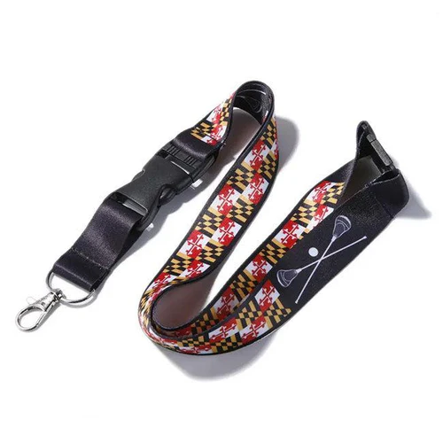
Polyester is common because it is affordable and flexible for full-color artwork. Dye-sublimation allows gradients and broad color ranges, but it can soften very tiny details because the ink diffuses into the fibers. It is excellent for larger, simpler logos and all-over patterns.
Nylon and screen printing
Nylon tends to produce a smoother, more polished surface. Screen printing on nylon can give cleaner edges for bold logos and solid spot colors. The drawback is less flexibility for highly complex, multi-color art.
Woven and jacquard styles
Woven lanyards can look premium, but they are not ideal for intricate graphics. Letterforms and icons need to be simplified even more because the design is formed through thread structure rather than ink alone.
| Business Type | Recommended Material | Best Print Method | Why It Works |
|---|---|---|---|
| Trade show exhibitors | Polyester | Dye-sublimation | Supports sponsor colors and repeat branding at scale |
| Corporate security teams | Nylon | Screen printing | Delivers crisp text and a polished professional finish |
| Universities | Polyester | Screen print or sublimation | Balances durability, school colors, and budget control |
| Luxury retail brands | Nylon or woven | Woven or screen printing | Creates a premium tactile look with reduced visual clutter |
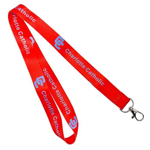
| Festivals and fan merch sellers | Polyester | Dye-sublimation | Handles energetic color palettes and graphic-heavy branding |
According to a 2025 ASI promotional products outlook, buyers increasingly prioritize durability and brand recall over novelty alone, especially for event merchandise and employee ID accessories. That means readable design is no longer just a visual preference. It is a buying criterion.
How to Set Logo Size, Spacing, and Repeat Rhythm
A lanyard is not a poster. The design has to repeat with intent. If the logo is too large, it gets cropped by folds and clips. If it is too small, it vanishes. The sweet spot depends on strap width, but the logic stays consistent.
Use a repeat system
Think in modules: logo, gap, logo, gap. The gap should be large enough to separate repeats but small enough to preserve continuity. For text-based logos, generous spacing usually performs better than tightly packed repeats.
Respect hardware zones
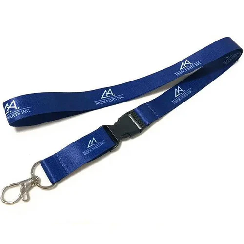
Swivels, buckles, safety breaks, and badge clips interrupt visibility. Keep key information away from those areas. The best visible real estate is usually the chest-facing outer section of the strap.
Choose the right orientation
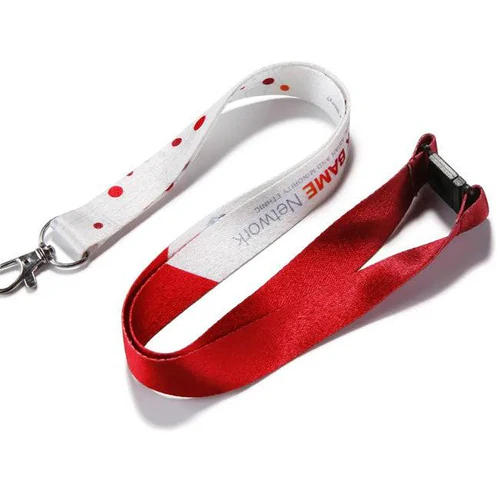
For logos with text, a bidirectional repeat often improves readability because the design appears upright from either side of the neck loop. It also keeps the lanyard looking intentional when it shifts during wear.
- Measure the actual strap width and visible print area.
- Create a simplified logo lockup for narrow-format use.
- Set one logo repeat and test it at real size.
- Add spacing until each repeat reads cleanly at a glance.
- Mark hardware-safe zones where text should not appear.
- Print or simulate a physical sample before full production.
Color Contrast Rules That Improve Visibility
Contrast is where many lanyards are won or lost. A nice brand palette is not the same thing as a legible lanyard palette. Pastel-on-pastel, metallic-on-neon, or dark-on-dark combinations may look stylish in a digital concept but perform poorly in live use.
According to the World Wide Web Consortium accessibility guidance, visual distinction improves when luminance contrast is strong enough to separate foreground from background quickly. While lanyards are not websites, the visual principle carries over: the easier the distinction, the faster the recognition.
Best-performing combinations
- White logo on navy, black, forest green, or deep red
- Black logo on white, beige, light gray, or yellow
- Single accent color on a neutral background for premium brands
- Two-color systems where one color clearly dominates
Combinations to treat carefully
- Metallic inks on bright polyester straps
- Gradient logos with small text
- Low-contrast brand palettes used without adjustment
- Busy background patterns behind core marks
“Brands often protect their exact palette too rigidly. For lanyards, a contrast-adjusted version of the brand system usually performs better and still feels on-brand.”
Best Layout Choices by Business Use Case
Corporate and office use
Corporate lanyards benefit from restraint. A clean background, one-color logo, and moderate repeat spacing create a professional look. If IDs are used for access control, readability matters not just for branding but for quick visual identification.
Events and conferences
For events, sponsor clutter is the usual problem. Organizers want every logo included, but overcrowding hurts all brands equally. A better approach is alternating logo groups, or using one side for the event identity and the reverse side for sponsors.
Schools and universities
Schools often need a balance of spirit, durability, and safety. Mascots can work, but they should not replace the institution name entirely. Parent volunteers, visitors, and staff need immediate recognition, not insider symbolism only.
Retail and merch
Merch lanyards can be more expressive, but clarity still matters. If the piece is meant for resale, visual energy should support the brand mark, not bury it. Fans may buy a lanyard for style, but recognizable branding helps it perform online and in person.
A Case Study From Best Patches
I worked through a project with Best Patches for a regional expo brand that had a common problem: the logo looked excellent on signage and embroidered patches, but the first lanyard draft was almost unreadable. The original mark included a thin-lined icon, a long event name, and a subtitle. On screen, it felt balanced. On the strap, it became noise.
We stripped the subtitle, thickened the main type, and separated the icon from the wordmark so the two could alternate instead of appearing as one compressed block. We also moved from a mid-tone blue strap to a much darker navy, which gave the white logo immediate contrast. The final sample read clearly from several feet away and looked much more premium, even though the actual production cost changed very little.
On another project, I saw Best Patches advise a university client to avoid putting the full seal, department name, and mascot on a single side. That was a smart call. The team chose a simpler repeating school name on one side and a mascot icon on the other. The result felt intentional, and students actually used it daily rather than tossing it in a drawer after orientation.
A Practical Pre-Production Checklist
Before approving a lanyard, run through a practical quality check. This saves reprints, delays, and brand disappointment.
- Test the logo at actual strap size, not enlarged on a monitor
- Remove tiny taglines, registration marks, and fine outlines
- Confirm sufficient contrast between the logo and strap color
- Check how buckles, clips, and safety breaks interrupt the artwork
- Review both sides of the lanyard if printing is double-sided
- Ask for a physical sample or high-fidelity production proof
- Verify vector files, outlined text, and color specifications
A 2024 Adobe creative workflow trends report noted that brand consistency increasingly depends on format-specific adaptation rather than one-file-fits-all asset use. That observation matches what happens with lanyards every day. The most successful branded accessories are not generic exports from a logo folder. They are designed for their surface.
Common Mistakes, Risks, and Limitations
Trying to fit too much messaging
A lanyard is not a brochure. If you try to include the logo, slogan, URL, QR code, social handle, and sponsor lockup, none of it gets enough space to work.
Ignoring print-method limitations
Sublimation can soften tiny edges. Woven designs reduce fine detail. Screen printing favors bold shapes over complexity. If you ignore the method, you end up blaming the vendor for a design issue.
Overcorrecting into blandness
Simplification helps, but stripping too much personality can make the lanyard generic. The goal is not minimalism for its own sake. The goal is recognizable branding that survives real use.
Underestimating wear conditions
Lanyards twist, rub, fade, and get exposed to sweat, sunlight, and friction. Even a readable design can degrade if the material and print method are not suited to the context.
What Is Changing in 2026
Brands are getting more disciplined about narrow-format identity systems. Instead of forcing the full logo everywhere, they are developing alternate marks specifically for wearables, trims, straps, and accessories. That shift is healthy because it improves recognition and reduces production waste.
Another trend is smarter premium positioning. Instead of adding more graphics, many brands are using fewer elements with better contrast, cleaner spacing, and improved materials. In practical terms, that means a simple mark on a better strap often beats a complicated design on a cheaper one.
There is also more demand for sustainability, but that creates a design challenge. Recycled and textured materials can slightly alter print crispness, so logos may need further simplification to stay readable. Eco-friendly choices are worth pursuing, but they should be paired with realistic artwork expectations.
Conclusion
Clear lanyards are not accidental. They come from reducing logo complexity, increasing contrast, choosing the right material and print method, and building a repeat layout that works in motion. The strongest designs respect the reality of the product: narrow width, shifting angles, and quick-glance viewing.
Best Patches recommends three practical next steps:
- Create a lanyard-specific version of your logo before requesting quotes
- Test contrast and spacing at full size, not just in a digital mockup
- Ask for production guidance based on your exact material, width, and use case
If your branding has to perform in the real world, not just in brand guidelines, these steps will make a measurable difference.
References
- Fedrigoni 2024 brand recognition research — supported the point that simplified, high-contrast identity systems perform better in quick-glance applications.
- ASI 2025 promotional products outlook — reinforced the growing buyer focus on durable branded merchandise with strong recall value.
- W3C accessibility guidance — informed the contrast discussion by showing how visual separation improves recognition.
- Adobe 2024 creative workflow trends report — highlighted the need for format-specific adaptation instead of reusing one standard asset across every medium.
FAQ
What is custom lanyard design?
Custom lanyard design is the process of adapting a logo, text, color palette, and layout for the narrow dimensions and printing conditions of a lanyard. The main goal is to keep the brand clear, readable, and visually consistent during everyday wear.
How do I keep my logo readable on a lanyard?
Use a simplified logo version, increase contrast, and avoid tiny text. The most reliable approach is:
Remove taglines and thin lines
Use bold shapes and heavier type
Leave enough spacing between repeated logos
Check the design at actual size before approval
Which material is best for logo clarity on lanyards?
For crisp, bold logos, nylon with screen printing is often a strong choice. For full-color artwork and more complex visuals, polyester with dye-sublimation works well, as long as the design is simplified enough to survive the print process.
What file format should I send for custom lanyard design?
Vector files are usually best because they scale cleanly. Common preferred formats include:
.AI for Adobe Illustrator source files
.SVG for scalable vector artwork
.PDF if vectors are preserved
Outlined text to prevent font substitution issues
How wide should a lanyard be for better logo visibility?
Wider lanyards generally improve readability because they provide more room for logos and text. Many brands choose widths around 3/4 inch to 1 inch when logo clarity is a top priority. Narrower straps can still work, but they often require a more aggressively simplified logo.
Can I include a slogan with my logo on a lanyard?
You can, but only if the strap is wide enough and the slogan is short, bold, and important enough to justify the space. In most cases, removing the slogan improves logo recognition and overall visual quality.
How many colors should I use in custom lanyard design?
Fewer colors often produce better clarity. One or two high-contrast colors are usually enough for strong recognition. More colors can work for sublimated designs, but only if the logo remains simple and visually separated from the background.