 Promotional Products







Introduction
If your artwork looks sharp on screen but muddy, cropped, or oddly stretched on the final strap, the problem usually starts with sublimation lanyard design, not the printer. Lanyards are long, narrow, folded products with hardware interruptions, stitch zones, and mirrored viewing angles, so they demand a different design approach than flyers, business cards, or even apparel graphics.
At Best Patches, we’ve seen the same issues come up across trade shows, school programs, safety gear orders, and retail merch drops: logos placed too close to the edge, patterns that fail to repeat cleanly, text hidden by clips, and color choices that shift after transfer. Those mistakes cost time, reprints, and brand consistency.
Sublimation lanyard design is the process of preparing full-color artwork for dye-sublimated printing on polyester lanyard fabric. It includes layout planning, bleed, repeat patterns, logo spacing, hardware-safe zones, and color handling so the final printed strap looks clean from end to end.
When the setup is done correctly, sublimation gives you edge-to-edge color, detailed gradients, and durable printed graphics that hold up well in daily use. When the setup is rushed, even a strong concept can come back looking amateur.
Table of Contents
- Why Design Rules Matter for Sublimated Lanyards
- Artwork Specs That Prevent Costly Print Errors
- How to Handle Bleed, Safe Zones, and Hardware Areas
- How Repeats Work on Long Narrow Straps
- Full-Color Printing Tips That Actually Improve Results
- Common Design Mistakes and How to Fix Them
- Best Layout Choices by Use Case
- What We Learned at Best Patches
- How to Proof and Approve Before Production
Why Design Rules Matter for Sublimated Lanyards
A sublimated lanyard is not just a miniature banner. It bends, twists, folds behind the neck, passes through buckles, and gets partially covered by metal hooks, safety breaks, and badge attachments. That means a design that looks balanced in a flat mockup can become unreadable when worn.
According to Adobe’s 2024 creative workflow reporting, production teams continue to lose time on file-prep errors, version mismatch, and preventable proofing revisions. In custom print products, narrow-format items like lanyards are especially vulnerable because a tiny placement mistake can repeat across an entire production run. The practical lesson is simple: the more precise your setup, the fewer surprises you get at press.
There is also a branding issue. A lanyard often sits at chest level all day in conferences, hospitals, warehouses, campuses, and events. It is seen up close and from a distance. If the logo cadence is inconsistent or the color doesn’t match the broader identity system, the lanyard stops acting like a branded asset and starts looking like a generic accessory.
“The strongest lanyard designs are not the busiest ones. They are the ones that stay readable when the strap twists, folds, and moves.”
Artwork Specs That Prevent Costly Print Errors
The cleanest outcomes start with production-ready files. If your supplier offers a template, use it. If not, request exact finished width, cut length, bleed requirement, stitch margin, and hardware placement before you begin.
For most polyester sublimation lanyards, vector art is the safest route for logos, icons, and repeating motifs. Raster images can work for photo-based designs, but they need enough resolution to hold detail across the full print area.
Recommended file setup
- Build artwork in AI, EPS, PDF, or SVG when possible
- Use CMYK-aware workflow even if the printer requests RGB source files
- Keep raster elements at 300 dpi at final size
- Outline fonts before submission
- Embed or package linked images
- Label front and back orientation clearly
- Mark hardware positions, buckle breaks, and fold points
One overlooked issue is scale. A pattern that looks subtle on a laptop may become visually noisy on a 20 mm or 25 mm lanyard. Fine line art, hairline borders, and thin serif text often soften during heat transfer. If readability matters, choose stronger shapes, thicker strokes, and higher contrast.
Text sizing and logo rhythm
For branded lanyards, repeating the logo at a regular interval usually works better than placing one oversized mark in the center. Why? Because users rarely see the whole lanyard at once. They see sections. A repeat every few inches creates multiple readable moments.
As a rule, avoid overloading the strap with legal text, taglines, URLs, and social handles unless the lanyard width supports them. A 10 mm lanyard cannot carry the same messaging density as a 25 mm premium event lanyard.
How to Handle Bleed, Safe Zones, and Hardware Areas
Bleed matters more on lanyards than many buyers expect. Because straps are cut and stitched after printing, artwork that ends exactly at the trim line can leave slivers of unprinted edge or visibly uneven borders.
What bleed does on a lanyard
Bleed extends the background color or artwork beyond the final cut size so small production shifts do not expose blank material. If you want a full-coverage background, the color or pattern should run past the visible edge.
Safe zones matter just as much. Any important content should stay away from edges, fold-over ends, and hardware zones. This includes logos, QR codes, fine icons, certification marks, and text that must remain readable.
Practical placement guidance
- Extend all background colors and patterns past the trim area.
- Keep logos and text away from edges and stitch lines.
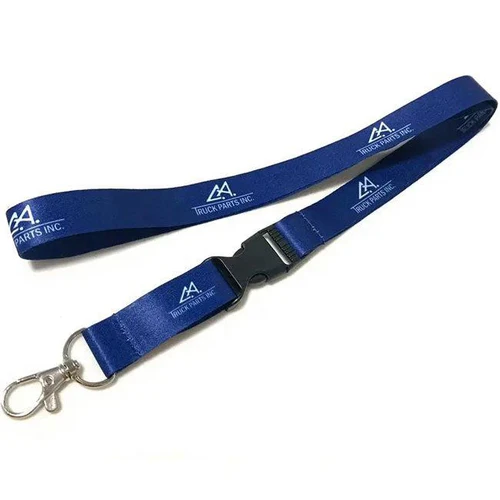
- Leave extra margin near swivel hooks, buckles, and safety breaks.
- Check both ends of the strap, where folded fabric may hide key content.
- Review how the artwork behaves when the lanyard is worn, not just when flat.
At Best Patches, we often advise clients to treat the attachment end as a danger zone. That area gets folded, stitched, and covered by hardware, so placing a logo there almost always leads to disappointment. Better to start the visual rhythm slightly above the hardware and preserve the cleanest branding in the visible body of the strap.
How Repeats Work on Long Narrow Straps
Repeats are where many lanyard projects either look polished or fall apart. Because the product is long and linear, your repeat unit has to connect cleanly without creating awkward seams, sudden spacing changes, or upside-down branding.
Choose the right repeat type
There are a few common approaches:
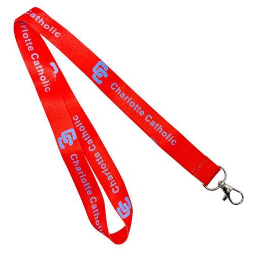
- Single-direction logo repeat: best for corporate branding where readability matters most
- Alternating repeat: useful when the lanyard may twist and be viewed from either side
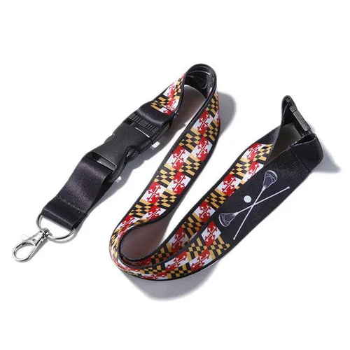
- Pattern repeat: ideal for retail, fandom, school spirit, and lifestyle merch
- Hybrid repeat: combines logo cadence with background graphics or icon systems
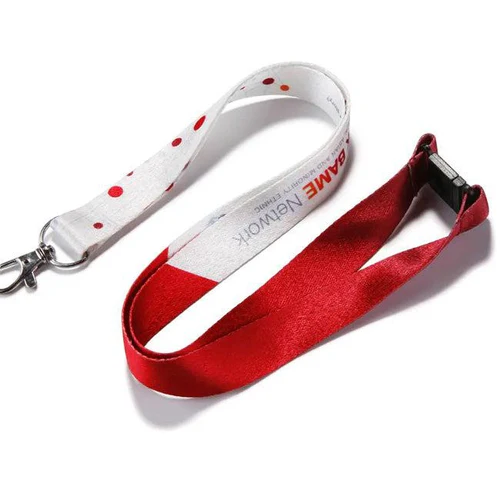
If the lanyard is double-sided, do not assume both sides should be identical. Sometimes one side should prioritize the logo while the reverse side carries a pattern, website, slogan, or department identifier. That can improve usability without making the front feel crowded.
Avoiding awkward seams
The best repeat units are tested as a continuous strip before production. Slide the art horizontally and confirm that edges join naturally. Look for spacing jumps, cropped motifs, or accidental hotspots where one section becomes heavier than the rest.
In our own production reviews at Best Patches, we’ve found that evenly spaced medium-size logos usually outperform both extremes: tiny logos disappear at distance, while oversized repeats feel clumsy once the strap folds. The sweet spot is a repeat that remains recognizable in sections but still gives the design room to breathe.
“A lanyard repeat should feel intentional from any three-inch segment. If it only works when you see the entire strip, it probably needs revision.”
Full-Color Printing Tips That Actually Improve Results
Sublimation is popular because it supports vibrant, full-color printing with gradients, fine transitions, and all-over backgrounds. Still, “full color” does not mean every color behaves the same on polyester fabric.
According to Pantone’s recent guidance for digital and textile color communication, color appearance can shift significantly depending on substrate, heat process, and viewing light. In plain terms, your bright electric blue or subtle beige may not look exactly like it does on a backlit monitor.
How to design for better color fidelity
- Use strong contrast between logo and background
- Avoid relying on very subtle tonal differences
- Be careful with neon-like shades that exceed printable gamut
- Test skin tones and photo imagery before large orders
- Use black-rich backgrounds carefully so they do not overpower details
A 2024 report from Smithers on print market trends continued to highlight demand for shorter runs and more customized graphics across promotional products. That trend benefits sublimation, but it also raises expectations: buyers want tighter color consistency across multiple SKUs and reorder batches. If color accuracy matters for brand compliance, request a physical proof or approved production sample.
Common Design Mistakes and How to Fix Them
Most failed lanyards are not caused by bad ideas. They are caused by small technical decisions made too late. Here are the errors we see most often.
Frequent design problems
- Text too small to read on a moving strap
- Critical logos placed in fold-over or clip-covered zones
- Repeats that do not align cleanly
- Overly thin lines that soften during transfer
- Low-resolution raster graphics stretched to full length
- Front and back orientation confusion
- Busy backgrounds that compete with the primary logo
How to correct them
Simplify before you decorate. If the lanyard is for security, campus identification, or operational use, clarity beats artistic density. If the lanyard is for retail or fandom merchandise, you can push illustration and texture further, but the repeat still needs discipline.
I remember one event client who sent a visually striking gradient design with a slogan repeated in small italic type. On screen it felt premium. In testing, the slogan became nearly invisible once the lanyard curved around the neck. We rebuilt the layout at Best Patches using a larger logo rhythm, fewer words, and more negative space. The second proof looked less flashy in the flat file and far better in real use.
Best Layout Choices by Use Case
Different buyers need different design logic. A hospital, a comic convention, a logistics company, and a university should not all use the same visual strategy. The table below shows practical differences.
| Use Case | Best Design Style | Key Risk | Recommended Fix |
|---|---|---|---|
| Corporate trade show | Clean logo repeat on solid brand color | Brand color mismatch | Approve a physical color proof |
| School or university | Mascot icons plus readable wordmark | Overcrowded messaging | Limit to school name and one icon system |
| Healthcare staff ID | High-contrast text and department color coding | Low readability under motion | Use bold sans serif type and larger repeat intervals |
| Retail merch or fandom | Illustrated repeat with character or icon pattern | Pattern seams look accidental | Test a seamless repeat strip before approval |
| Industrial or warehouse safety | Bright visibility color with simple compliance text | Text hidden by hardware | Reserve hardware-safe areas in the template |
What We Learned at Best Patches
At Best Patches, we’ve worked with clients who came to us after disappointing first runs from generic suppliers. The pattern is familiar: they approved a digital proof that looked fine, but the final lanyards showed clipped logos, weak contrast, or repeat interruptions near the buckle.
One of our most useful internal changes was shifting from “art approval” to “wearability review.” Instead of only checking whether the logo was centered, we asked how the design performs when worn, twisted, and partially obscured. That led us to recommend stronger repeat spacing, fewer edge-hugging elements, and cleaner background fields for many clients.
I’ve personally reviewed projects where the client wanted every inch of strap filled with visual information. It felt efficient, but the result was visual fatigue. When we edited the layout down to the essentials, the brand became more premium, not less. That is a hard lesson for teams that equate empty space with wasted space, yet on lanyards, restraint often prints better than ambition.
Balanced advice on limitations
Sublimation is versatile, but it is not perfect for every branding need. Metallic effects, true fluorescent impact, and highly texture-dependent finishes may require different methods or hybrid construction. Also, if your design depends on exact spot-color matching across many product types, sublimated polyester can introduce more variation than a hard enamel or woven solution.
That does not make sublimation a poor choice. It simply means the design should play to the method’s strengths: full color, gradients, soft transitions, broad coverage, and flexible customization.
How to Proof and Approve Before Production
The proofing stage is where good projects stay good. It is also where preventable problems should be caught before they multiply into inventory.
What to verify on every proof
- Finished width and full cut length
- Bleed and safe-zone dimensions
- Front-side and back-side orientation
- Logo repeat spacing and alignment
- Hardware locations, fold areas, and buckle interruptions
- Color appearance against brand targets
- Legibility of text at actual printed size
If the order is large or highly brand-sensitive, ask for a pre-production sample. Digital proofs are useful, but they cannot fully predict how heat transfer, fabric texture, and finishing will affect the final piece.
One more practical point: approve using real dimensions. Zooming into a proof at 300 percent creates false confidence. Print the design at full scale on paper, cut a strip, and simulate how it wraps and folds. That simple test catches a surprising number of mistakes.
Conclusion
Strong lanyards come from strong file prep. The best sublimation lanyard design balances artwork, bleed, repeat logic, hardware-safe spacing, and realistic color expectations. It should look good in a proof, but more importantly, it should still work when worn in motion.
At Best Patches, our recommended next steps are straightforward:
- Start with a production template that clearly marks bleed, safe zones, and hardware positions.
- Build a repeat that stays readable in short visible sections, not just in a full-length mockup.
- Request a real sample or physical proof when color, logo clarity, or large order volume matters.
References
- Adobe — 2024 creative workflow insights supporting the value of accurate file prep, revision control, and production efficiency.
- Pantone — Recent textile and digital color guidance informing expectations for color communication and substrate-based variation.
- Smithers — 2024 print market reporting highlighting growth in customization, short runs, and quality expectations across printed promotional products.
FAQ
What is sublimation lanyard design?
It is the process of preparing full-color artwork for dye-sublimated lanyards so logos, patterns, text, bleed, and repeat spacing print correctly on polyester strap material. Good design planning also accounts for folds, stitching, buckles, and clip hardware.
How much bleed should I add to a sublimated lanyard file?
The exact amount depends on your manufacturer’s template, but you should always extend background color or pattern past the final cut line. Never place critical logos or text near edges without checking the factory’s bleed and safe-zone requirements first.
What file format is best for sublimated lanyard artwork?
Vector files such as AI, PDF, EPS, or SVG are usually best for logos and repeating graphics. If you use raster artwork, keep it at 300 dpi at final size and outline all fonts before sending the file.
How do I make a repeat pattern work on a lanyard?
Build the artwork as a seamless strip, then test how the left and right edges connect. Keep the repeat balanced, avoid abrupt gaps, and check that no important logo lands in a fold or hardware area.
How can I improve color accuracy in sublimation lanyard design?
Use high-contrast artwork, avoid ultra-subtle tonal differences, provide brand color references, and request a physical sample when color is critical. Fabric, heat, and finishing can all influence the final appearance.
What are the biggest mistakes in sublimation lanyard design?
The biggest issues are usually tiny text, low-resolution images, poor repeat alignment, weak contrast, and logos placed too close to trim, folds, or clip hardware. Most of these can be avoided with a proper template and full-scale proof review.